Update 2022-07-20: Updated article to include Jay Castro and his work behind the design
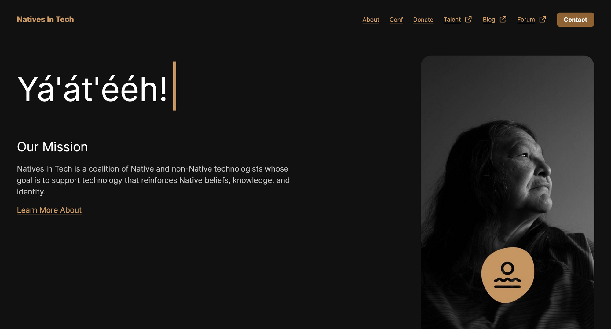
Over the past few weeks Natives in Tech has been working on a rebrand. This rebrand is different from years past when we were just working with what we had. This rebrand had a focus and intention and that came from UX designer Eli Brumbaugh and UX Content Strategist Jay Castro. We'll let them describe it:
Eli
We wanted the brand to invoke a sense of humanity. A reminder that while we work in technology, we are not machines. To accomplish this, we used organic asymmetry to create a handcrafted feel. Our desire was to make a mark that embodies our collective and yet profoundly distinct histories. The circle represents the sky (sun, moon), the squiggle (water), and, last but not least, the line (earth). This natural symbolism is a unifying thread that ties us together.
Jay
We aligned that these elements are part of a greater underlying commonality among all Indigenous peoples, everywhere. These elements are tangible, they’re real, and they mean something different to every community. We referred to them as “Land, sea, and sky.” And as easy as it is to speak these words, the design poured out in a very natural way. It took no more than 10 minutes and a few sticky notes to visualize this concept and feel the connection to the elements—land, sea, and sky.
We plan to stick with this design for years to come and we hope you like it! Check out https://nativesintech.org/ to see more.
Some things to note:
- We have a dark theme and light theme, so depending on your machine or device it will adjust accordingly
- We are still in the process of updating all of our services with the new logo and colors so you might see some out of date
- The project is open source just like it's always been. If you see something that can be improved head to https://github.com/nativesintech/nativesintech.org
Continue the Conversation
Natives in Tech Rebrand


